Talkdesk Redesign
The Talkdesk Redesign brief was as much about a major redesign as it was about redefining it’s overall user experience (UX Design). Take a step back and look at the bigger picture. The end result is the product of hard work and lots of love.
For the new Talkdesk Redesign we started from scratch, designing user flows based on current user data, discovering problems along the way, and solving them. We re-evaluated everything from typography to icons to the tone-of-voice. A true user experience (UX) design process.
Data Analysis
The first thing we (the client and I) did was to analyse the current site data. What works and what needs fixing. After a couple of weeks we had set our game plan on how to tackle and solve the main pain points. We now also had a clear vision on how the site must be positioned and what feelings it must convey to the end user. We had our goals.
Setting the style
To get things rolling, we first decided upon a color style guide, based largely on the existing color scheme, but with a bit more *punch* and also some extra colors to get going.

Visual language
The next thing I did was set an icon design language. The client was open to existing sets but nevertheless there’s usually never a single set that rules them all. I really liked the ikooni outline collection by Laura Reen, so we used those as a base to create an almost from-scratch new icon set. In total, over 80 icons were used on the new site.
Content and Tone of Voice
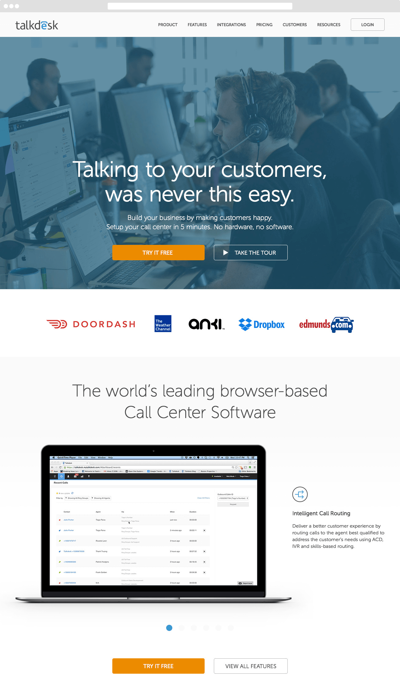
The content – for the most part – was going to be re-written from scratch. The tone of voice was rather friendly and casual, and instead of hard selling the “product”, we were selling the emotions that were generated from using a product this easy – thus extending the benefits in a very vocal way.
Design & Style
We opted for bold imagery, large type. I was lucky enough to have been supplied a great set of real-life Talkdesk employee photos, which fit in perfectly with our tone of voice. Being real is what it’s about…

Responsive Design
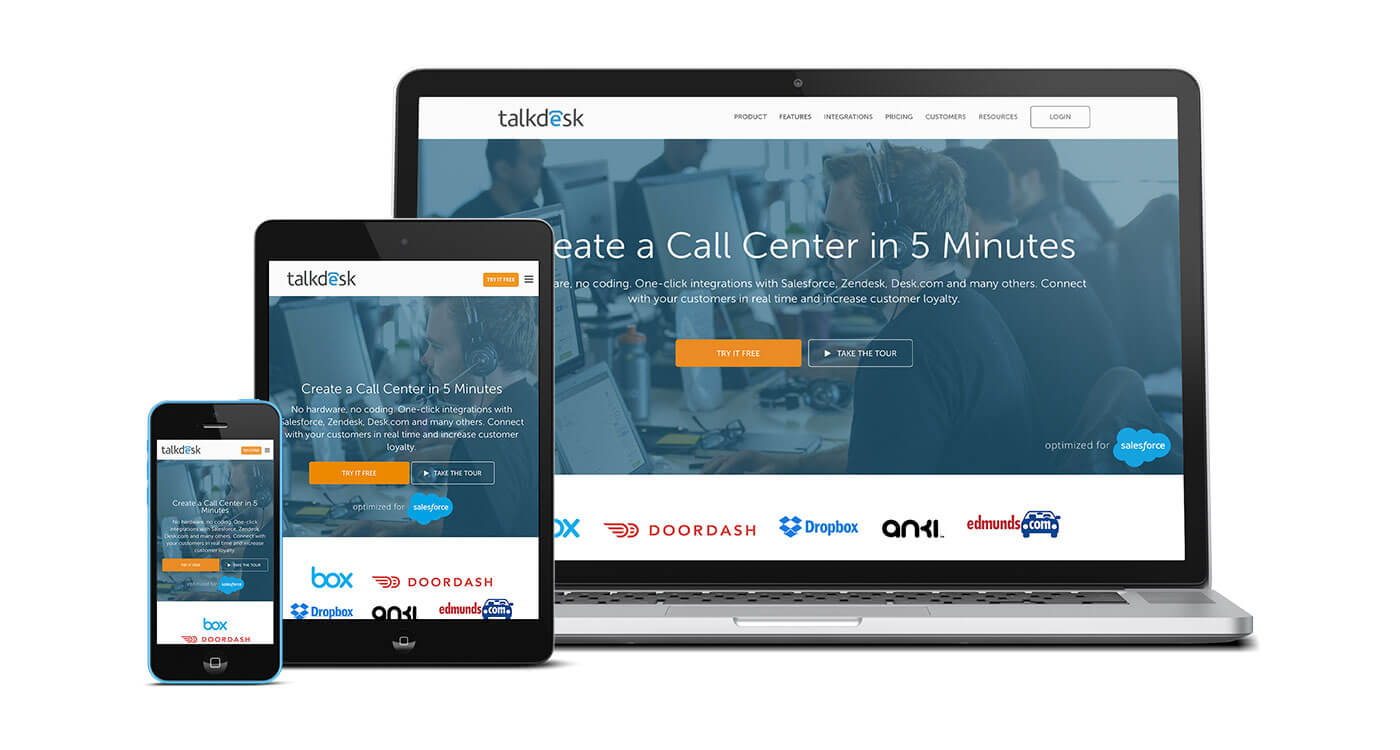
From the very beginning we were designing with all screens in mind. From the very large desktops to the smallest device screens. Navigation systems fall back into a condensed menu, while typography and margins re adjust accordingly.

Development
The entire site was re-built from scratch as a responsive WordPress theme. The custom theme was created to accommodate every last bit of editable information, on every single page. All coding was done by the talented Panagiotis Grigoropoulos.
The client
A huge THANK YOU to the entire Talkdesk team for their outstanding support and the amount of work they put into this project. I’m not sure if anything would have been accomplished if it not for them.
Bonus: Behind the scenes while launching the site
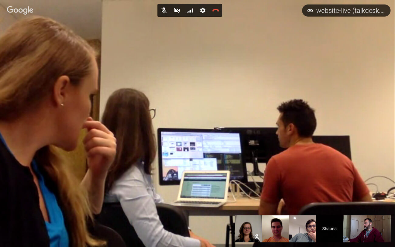
Launching a site like this involves many people. In this particular case, we went multinational with teams located in San Francisco (United states), Lisbon (Portugal) and Athens (Greece). Here’s a snapshot from the control room in Portugal

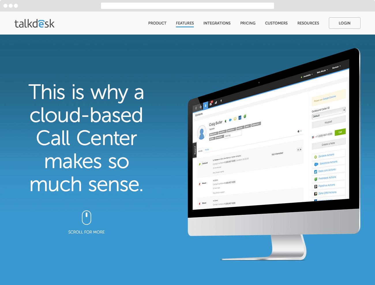
View the new Talkdesk site.
About Talkdesk
Talkdesk is the world’s leading cloud-based call center software solution. With an easy-to-use interface, robust call center functionality for sales and support teams and one-click integrations with business tools such as Salesforce, Desk.com and Zendesk, Talkdesk is the platform customer-centric companies use to thrive. Create your call center in 5 minutes with Talkdesk.
Work Performed: Art Direction, Copywriting, Creative Concept, Creative Direction, UX Design
Let's work on something together, contact me!


